Objective
The objective is to update an existing logo to add value to the business, and build a new customer base. The approach was to represent the brands name through a modern visualization of music. The new direction the brand needs to take is a futuristic and appealing character for the new target demographic.
Research
The current demographic consist of a group of loyal regulars. Mostly mature to middle aged hobbyists, however there is a slowly emerging younger crowd. This new demographic was the target for the new redesign.
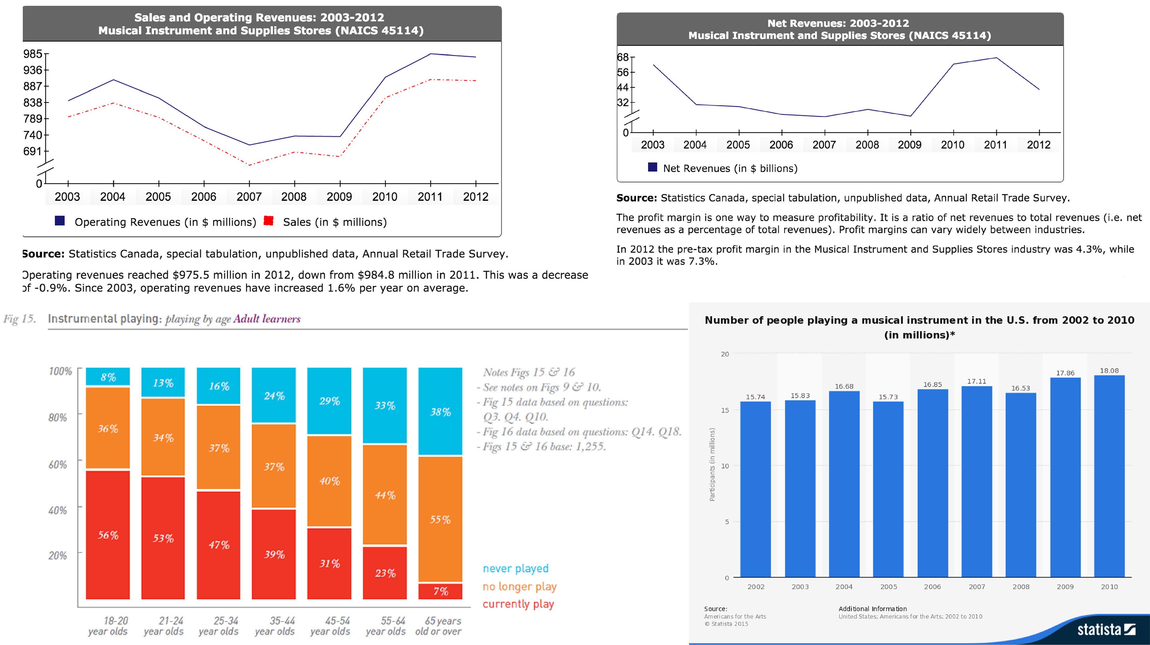
According to Statistics Canada, Musical Instrument and Supplies Stores are a slowly reemerging market. To better understand the sales of musical instruments several studies were taken into consideration. It is less likely to start or continue playing an instrument as a person ages according to a recent survey.
The survey suggests that 56% of 18-10 year olds currently play an instrument, compared to the 7% at the age of 65 and over. The logo design needs to appeal to a younger audience, in fact introducing a younger audience to musical instruments is crucial to the business's survival.
Art Direction
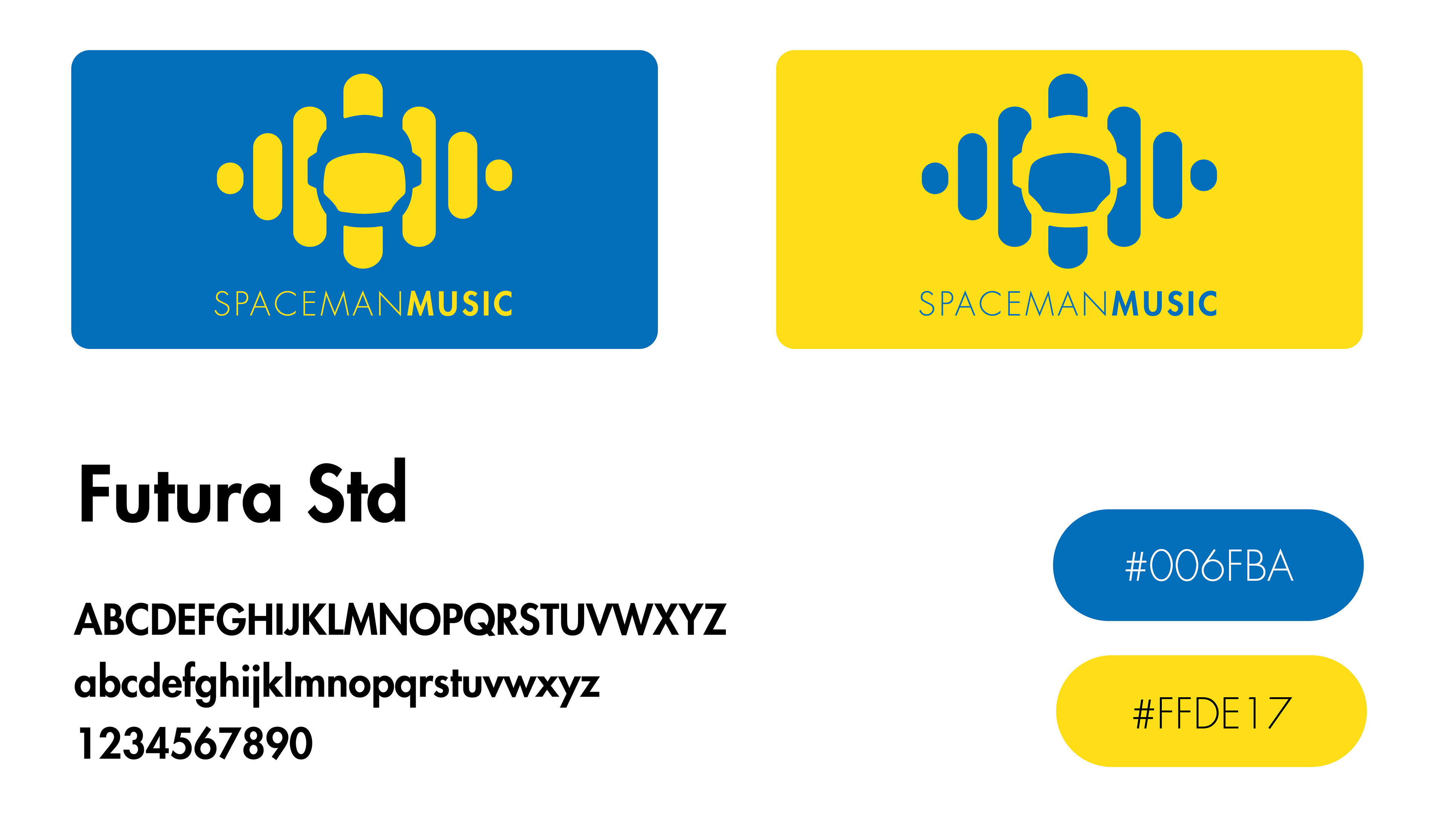
Futura is the only typeface to ever leave planet Earth. It was used on a plaque left on the moon by the astronauts of Apollo 11. Futura is a direct embrace of the modern era.
In terms of color choice, the deep blue chosen reflects intelligence and exploration, while the refreshing yellow is youthful energy. The gamut chosen embraces color harmony.