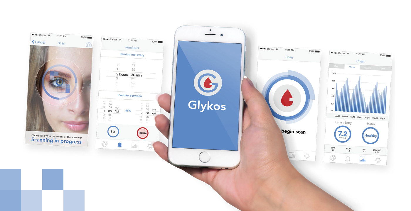
Glykos is a prototype app to help monitor the blood sugar levels for diabetics. Everything from the UX, UI, and branding were designed to reflect a professional medical aesthetic.
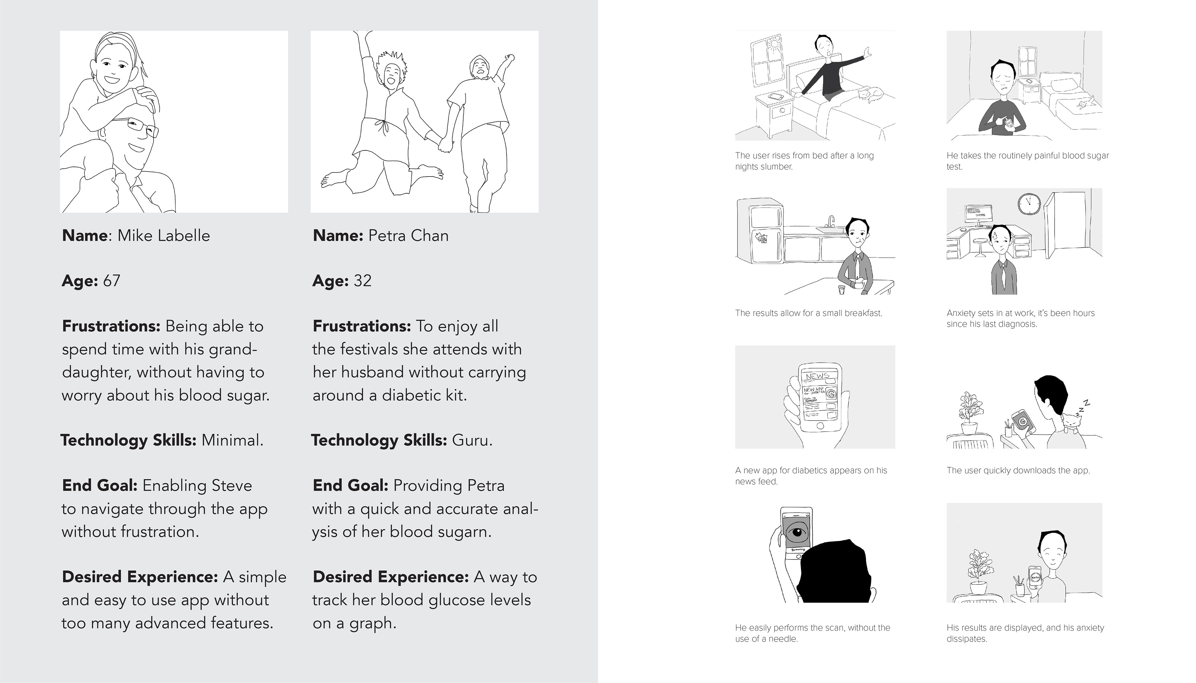
Defining the User
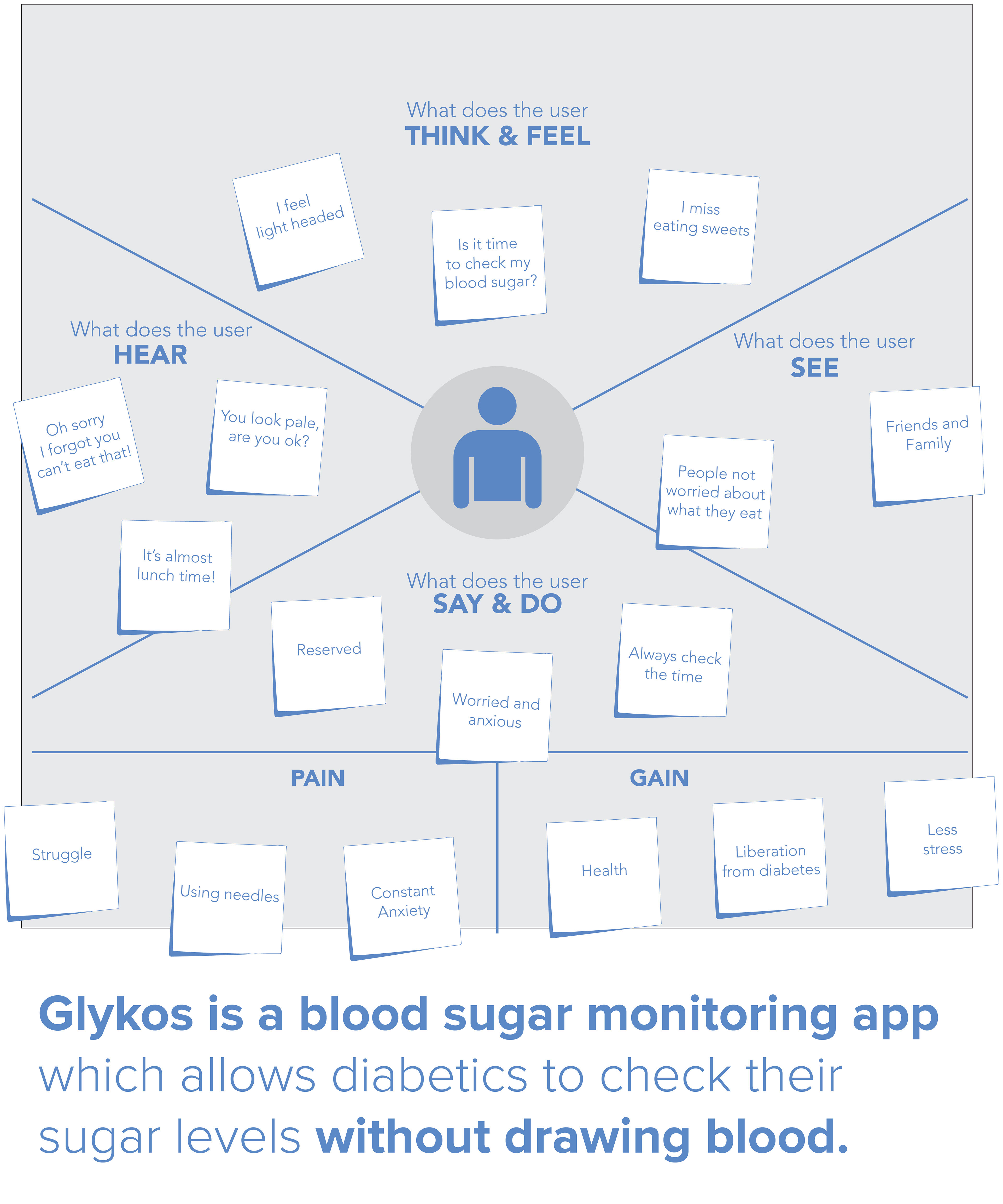
Did you know that a type 2 diabetic needs to check their blood glucose levels anywhere from four to eight times a day?
Checking blood glucose is done by drawing out blood with a small needle inserted to the tip of the finger. Using the apparatus to continually monitor blood glucose levels requires patience as the learning curve is steep. The entire procedure is time consuming, tedious, and painful.
Diabetics live in constant anxiety from their medical condition. Having a more efficient method of monitoring their blood glucose will be liberating and reduce their daily stress.
In North America over 9 percent of the population is affected by diabetes. Diabetics range from children to seniors. Although diabetes is more prevalent in seniors (age 65 and older are at 25% diagnosed), over 2 million new cases appear annually and these numbers continue to grow, especially in children and young adults.
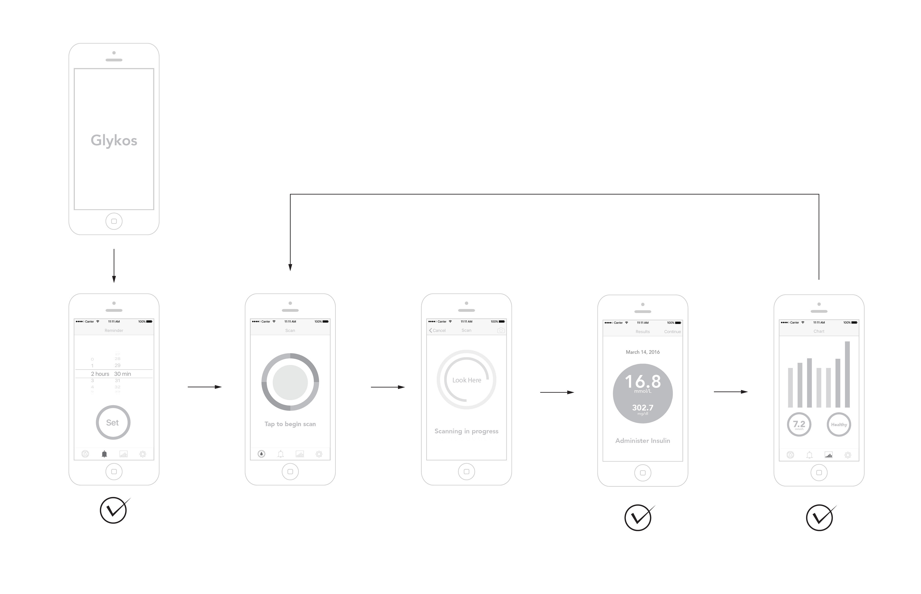
Flow Chart and App Flow
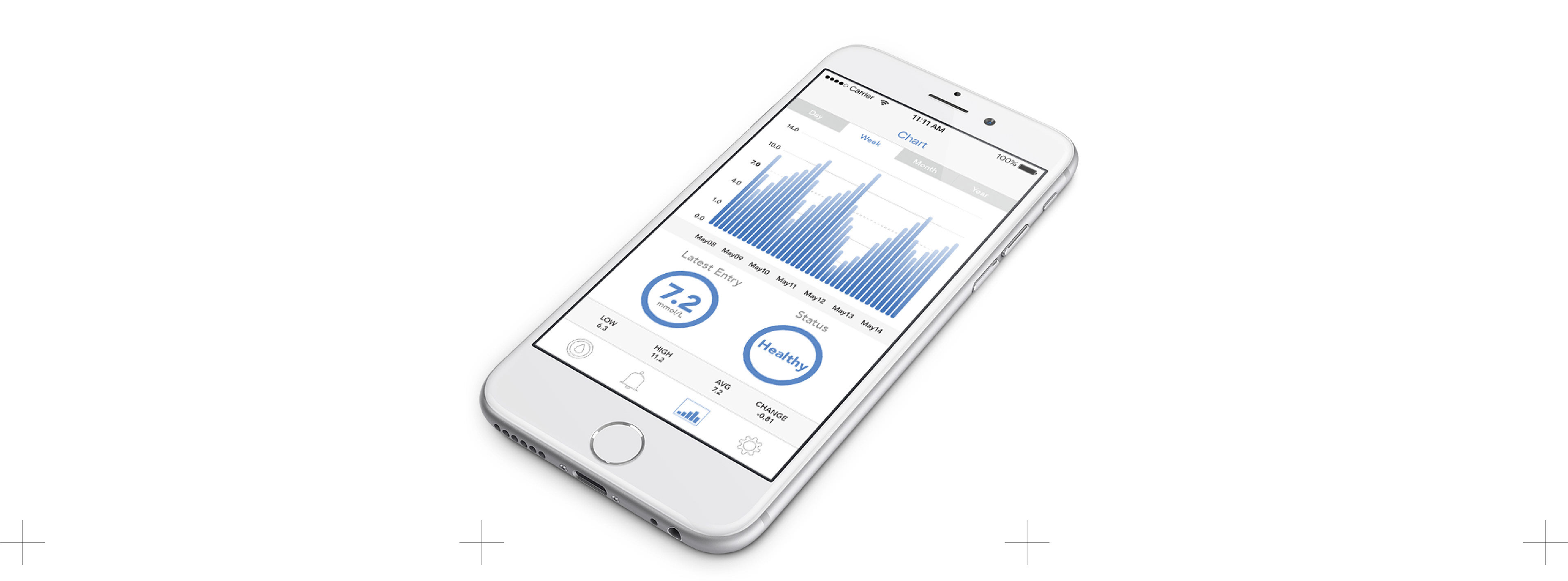
The following chart defines the path the user will take while using the app. There are two end goals for the user, to receive their diagnosis, and to see the information plotted on the chart.
Resorting to minimal use of menus and advanced features, the user is automatically directed through the steps and into diagnosis, and finally with the results displayed in a chart.
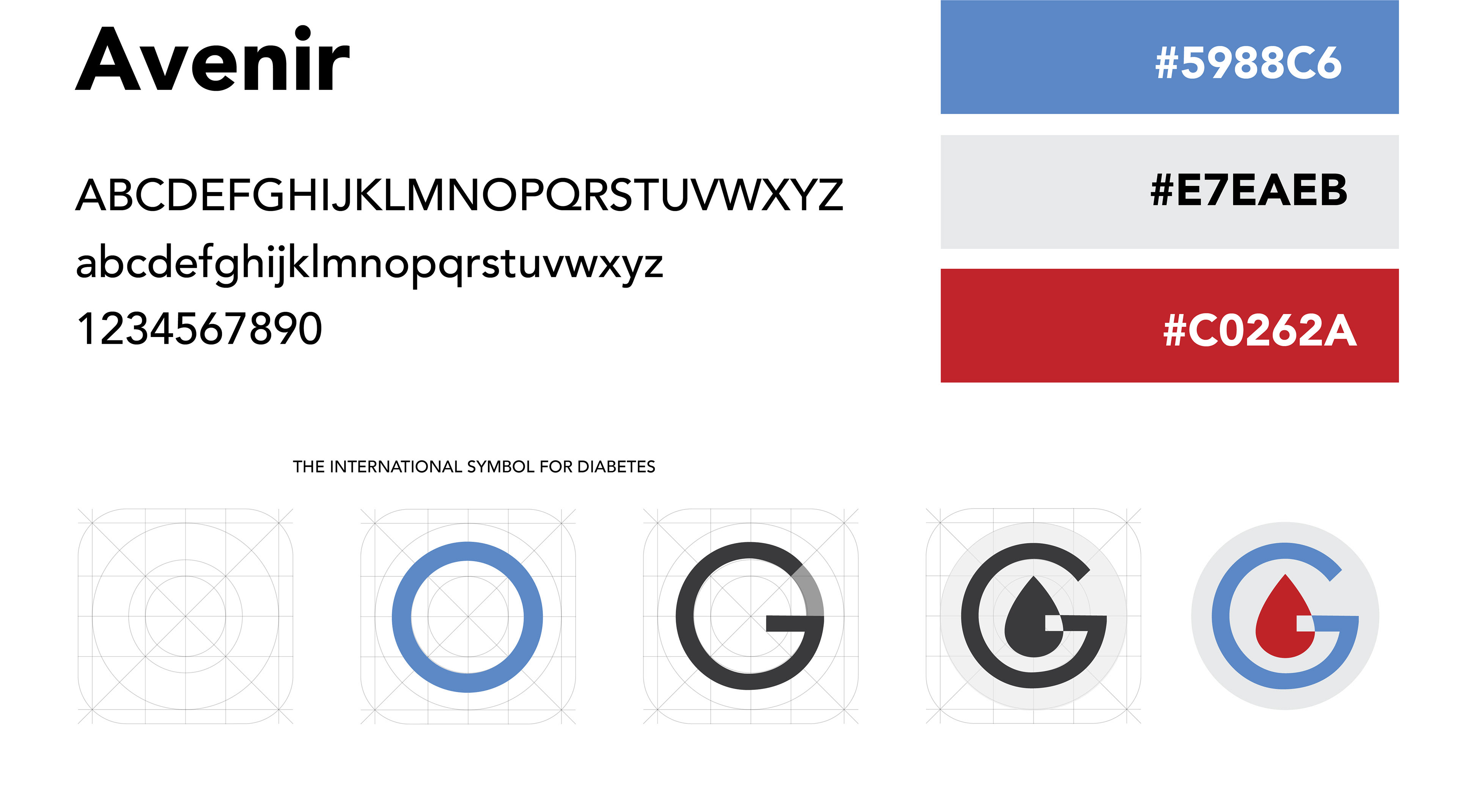
Art Direction
The universal symbol for diabetes was the source of inspiration for the branding and design of the Glykos app. The blue circle was used as the foundation of the app art design.
Circular patterns occur frequently in nature and are a symbol of life and health in countless cultures across the globe. The cool blue and bright red were used to communicate both the medical and biological aspects the app is designed for.